What is a good website?
When you visit a website, you often decide quickly whether to trust the site, want to use it, or leave it. A good website does more than look nice, it builds credibility, guides the user intuitively and makes it natural to act. In this post, we dive into four key elements that determine the quality of a website: Design, UX, conversion, and tone.
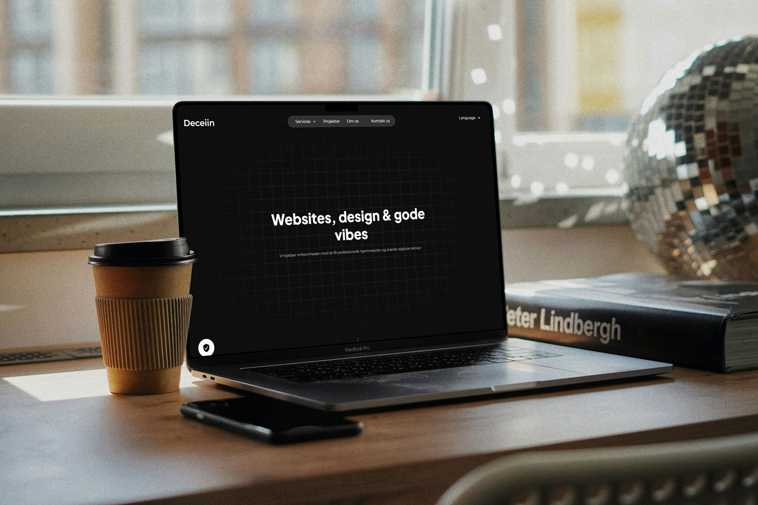
1. Visual design and first impressions
Visual design is often the first thing users notice. Studies show that up against 94% of first impressions is due to design and visual experience (Source: MindInventory).
In addition, a single second delay in loading can reduce page views by about 7%, which clearly shows how sensitive impression and performance are related (Source: MindInventory).
A strong visual design meets these criteria:
- A clean layout with clear structure
- Harmonious color selection and uniform typography
- Images and graphics that support content and message
- Deliberate use of visual intensity, too aggressive styling can counteract the experience (Source: Jankowski)
The design gives the user a signal of professionalism. Pages that look outdated or cluttered often lose the trust of visitors in seconds.
2. UX, navigation and user journey
Even the best looking design is useless if navigation lags.
88% of users are less likely to relapse after a poor user experience (Source: UXCam/UX Statistical Overview).
44% of users leaving a page whose contact information is not clear (Source: OptinMonster via UX Statistics)
To ensure a good user journey, you should focus on:
- A simple and intuitive menu structure
- Headings, sections and visual cues to help skim
- Short distance to important pages such as contact, services or product pages
- Clear next steps, users should never guess what they should do next
Navigation and structure should be obvious. The user should feel that he or she is on the right path without thinking about it.
3. Conversion and Call to Actions
A professionally designed website should not only inform, but also invite to action.
According to Landingi and UX research, a well-worked UI can increase conversions by up to 200%and when UX is additionally optimized, the increase can reach as much as 400% (Source: Landingi/UX Statistics)
Several studies also show that personalized CTAs can perform over 200% better than standard buttons (Source: UserGuiding)
When designing for conversion, you should:
- Balancing visual highlighting and text, CTA buttons should stand out
- Place CTAs in multiple places on the page (top, middle, bottom)
- Keep forms short and clear
- Minimize friction, ask only for the most necessary
By making it easy and attractive to take the next step, you increase the chance that the user will actually do it.
4. Tone of voice, content and credibility
Even with eminent design, UX, and conversion, bad content can ruin the experience.
A friendly, clear and consistent tone strengthens user confidence. According to UX research, brands are perceived as more trustworthy when the language is human and consistent (Source: UX & content research)
In addition, users become on average 88% longer on video content pages (Source: UXCam), demonstrating that media content such as video or animation can enhance user engagement
Tips for good content and voice:
- Write as you speak, use “you”, “your”, “we”
- Keep paragraphs short and structure the text with headings and lists
- Use visual content (images, video) thoughtfully
- Be Consistent: Same voice and style across the site
Consistency in language and expression creates recognizability and credibility.
So what have we learned?
A good website is a holistic product where design, UX, conversion and content work in harmony. Even minor adjustments can significantly lift the experience and results.
Think about:
- What does the user see first on the page?
- How many clicks does it take to find relevant information?
- Is there a clear action the user can take?
- Does the language feel authentic and consistent?
I hope you learned something new:)